Slowing Down Graphic Design
An Introduction.
I teach a course most fall semesters called “Time and Motion and Graphic Design.” In the fall of 2014, after reading Space-Time Problems by László Maholy-Nagy, an interesting discussion took place. One student asked the rest of us if we had ever considered that there could be multiple speeds of design. The student, Trace Byrd, proposed that we base most of our design decisions on the idea of quickly facilitating understanding. Our modern lives are fast, and so design must be fast to help information and understanding keep up with the pace of life. “What then,” Trace asked the class, “does slow graphic design look and behave like?”
Trace’s question caused all present to pause and think. What is fast design? What is slow design? I (nor the rest of the class) had not thought about design in this way before. A trajectory was born. For the rest of the fall Trace and several other students made work influenced by “slow design.”
For my thinking, this slowness trajectory was a revelation. I finally found a connection between my research into sustainable graphic design and what I taught in motion graphics. The two arenas had always seemed so disconnected before. Now sustainability and motion finally seemed related. I have since spent quite a bit of time thinking and designing in this new slow design arena.
Let us explore some origins for fastness and slowness in design, and then examine where slow design might exist in the contemporary arena.

The Viewer in Motion.
The most common physical definition of motion is a change in location over time. Newton’s laws define this type of physical motion: things moving (or not moving) in position. My class’s point of departure for their venture into slowness was an example from László Maholy-Nagy’s Space-Time Problems of this literal motion variety: a viewer traveling past posters at different speeds.
Cars and airplanes created the possibility to see things at high speed, for the first time putting the viewer into extreme motion, no longer limiting viewers to speeds they could walk or run (Maholy-Nagy, 78). To illustrate this, Maholy-Nagy references a study conducted by Jean Carlu from 1937. In this experiment, two posters are compared: a Henri de Toulouse-Lautrec poster (late 1800s) and a late 1930s art-deco modernist poster. The hypothesis was this: since the Toulouse-Lautrec was designed with a pedestrian as ideal viewer, and the Art-deco modernist poster with the driver of a car as ideal viewer, the Toulouse-Lautrec will fail in legibility at high speeds while the 1930s poster will succeed. The two posters were setup on their own moving tracks. In Maholy-Nagy’s retelling, when zipped along its track at 50mph the 1930s poster is perfectly readable. The Toulouse-Lautrec is first run down its track at a few miles per hour, fitting a pedestrian’s speed, where it is also readable. Then the Toulouse-Lautrec poster is sped up to the same 50mph run as the 1930s poster. At such a speed, the Toulouse-Lautrec becomes illegible.
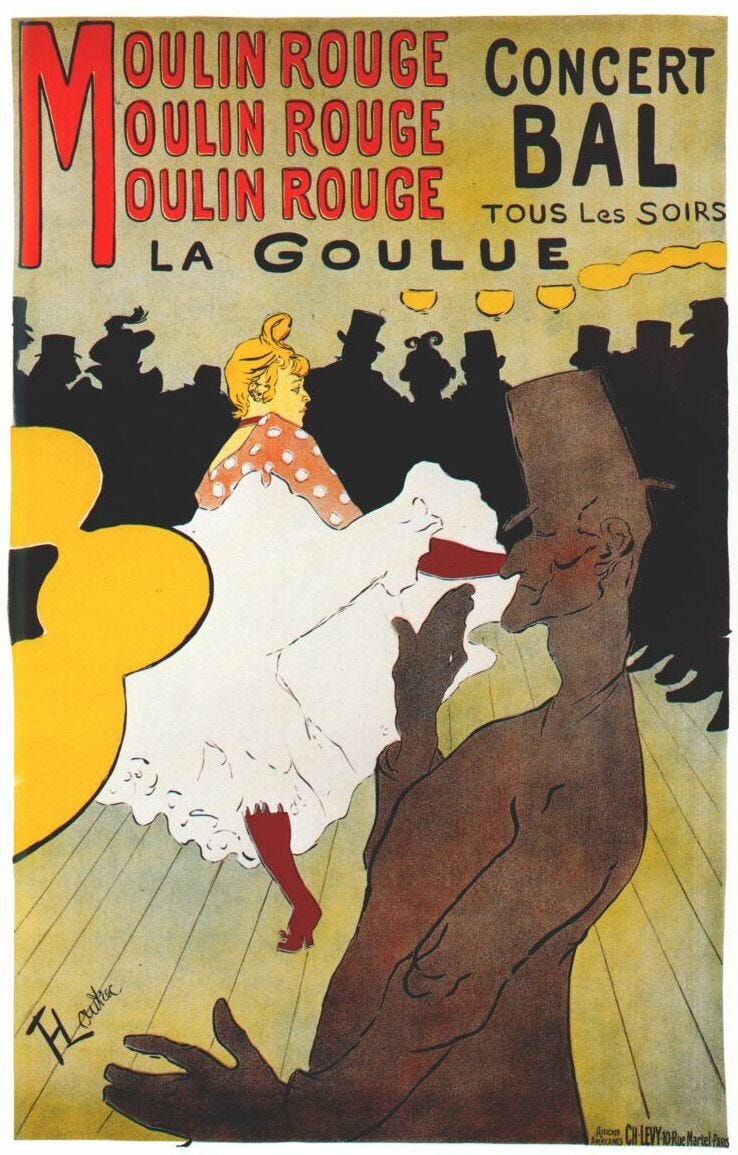
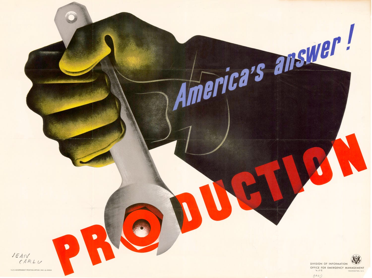
As Maholy-Nagy explains with the above example “motion, when accelerated to high speed, changes the appearance of objects and makes it impossible to grasp their details” (78). Toulouse-Lautrec made his works without “high speed” as a concern. Maholy-Nagy and his peers’ works acknowledge and accept the various ways the speed of the viewer can affect legibility. As such, the “modern” work is able to maintain clarity while the older work fails when viewed by a rapidly moving spectator.
Taking Maholy-Nagy’s thoughts to the extreme, when concerns revolve around viewers moving at high speeds, designers arrive at certain types of large, simple solutions. If one takes this path, then anything large and simple can be deemed “fast” design and anything with small type, details, etc. is relegated to “slow” design. However, I think it is more complicated than just simple = fast and complex = slow.
Fast/Slow Dualities
In What We See When We Read, Peter Mendelsund poses the question “does the speed at which we read affect the vividness of our imagination?” Mendelsund then asks “have you ever walked along the shoulder of a road upon which you normally drive?” This road, he explains, becomes two roads — two distinct experiences that might as well be two different places despite being the same “cartographical” place. Mendelsund uses this metaphor to then explain multiple kinds of reading experiences — one that quickly and simply provides a story, and one where the reader must invest time to understand what is going on (96). The scenario Mendelsund paints forces us to ask how are these fast/slow experiences different? How are they the same? What do you notice in one experience that you miss in the other?
The reader-as-driver from Mendelsund is like Maholy-Nagy’s and Carlu’s 1930s viewer: plowing along at 50mph hoping to catch a clear glimpse of passing designs (or words) and gulp down their meaning. The pedestrian (perhaps our Toulouse-Lautrec ideal viewer?) can be slow, contemplative and curious; meaning can be savored. The slow viewer sees things differently: what is below, what is above, what is alongside — not just what is in front.
If there are fast ways and slow ways to take in the same road, then one design can also be both fast and slow. The content or forms need not be different, but the way we ask participants to “see” changes. Fast designs are those with little extra to entice a closer look, slow designs are those asking viewers to stop in wonderment (Mendelsund makes this statement regarding the books he likes to read: “the best book,” he says, is one where you can “drive through quickly, but are forced to stop on occasion, to pull over and marvel” (96). One design is capable of both types of elements.
Robert Venturi in Learning from Las Vegas exemplifies this fast/slow multiplicity in his teams’ study of the Vegas Strip’s signage. The typical casino signage meant to be seen at speed from the freeway or wide boulevard does, on closer and slower inspection, contain a lot more information. In Venturi’s “Physiognomy of a typical casino sign” he explains that the “heraldry” of a sign, which is described as the “applied imagery, symbol, logo, to be identified at a long distance” is large and high, and perfect for grabbing the eyes of speedy viewers. The “information” is lower, and the “primary information is large and brief, as the information gets more specific it gets smaller” (Venturi, 68) — it is more likely readable by a close, slow viewer. This breaks up the typical casino sign into a “fast” top and a “slow” bottom.


Designs need not be only designed with only fast or slow in mind, a fast/slow dichotomy can be baked in. Some pieces of a design are okay flying by unnoticed at high speed. This accepts Maholy-Nagy’s statement that fast motion “makes it impossible to see the details” (Maholy-Nagy, 78), but doesn’t presume “fast” to be the only speed for viewing. Other details are still provided, rewarding a slower viewer.
Change Over Time.
Fast/slow when only thought of according to changes in position limits what “slow design” means. Aristotle’s definition of motion is more useful to a contemporary discussion: any change in quality or quantity over time (Adler, 33). Liberating the idea of speed from the moving viewer (or moving design) lets “slow design” become more robust in possibilities. Slow design can be a design where anything changes slowly over time, even the design process itself.
In his essay In Praise of Slow Design, Michael Beirut describes slow design as “a patient, cautious, deliberate evolution of a nearly unchanging format.” He then explains “slow design is not just about duration or speed, but about thoughtfulness, deliberation, and tender loving care” (237).
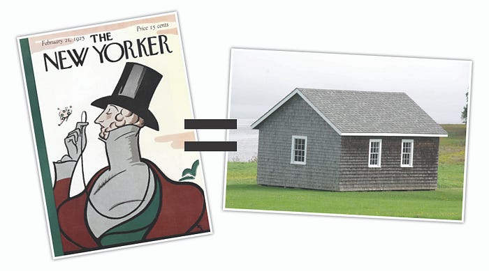
Beirut is describing the nearly unchanging aesthetic of The New Yorker. When something small does change, that change is intentional, planned, and carefully considered. Nothing is in “motion” just for the sake of motion, for the sake of novelty, or for the sake of change itself.
Beirut’s thoughts remind me of my favorite sustainability theorist, Stewart Brand. In his book How Buildings Learn, Brand quotes Dell Upton in stating that vernacular builders “are content to accept well-proven old solutions to old problems” (132). The vernacular process is a design process with little to no unnecessary changes, a slow design process. I saw vernacular principles as incredibly useful to my sustainability interests — “vernacular design is always prudent about materials and time” (134) — being one of my favorite things to try and merge into my graphic design practice for sustainability’s sake — but never saw it as relating to motion design. Then I read Beirut’s theorizing on The New Yorker’s slowness. The connection crystallized.
Vernacular methods honor time much better than modern cult-of-the-new, intentional obsolescence does. The New Yorker’s styling and a cape-cod’s form are exemplars of a slow design process. Their aesthetic change over time is nearly nothing. Contemporary gadget design (really anything relying on obsolescence to sell more units, cars, clothes, etc.), would be the fast variety of design process. Change specifically for change’s sake.
Interpretations of Slowness in Student Works
As my students were the launching pad for these slow considerations, I thought it relevant to look at what they created in their own lines of slow inquiry. The prompt for the following projects was: write an essay about how time and motion play a role in your design practice, and then, design that essay in a way that embodies what you explained. Students worked in multiple mediums, and explored several types of slowness.


Rene Arvizu wrote about dualities of fast/slow and the different kinds of motion available for exploration to a designer. He then explored these ideas by challenging the viewer’s ability to understand what they are seeing. Rene first made a kinetic type animation from the text of his essay. Next, the exported video file was opened in a text editor, and then converted the resulting file’s text into a simple typographic poster. Rene devised an alternate view of the video he made, basing the design on traditional layouts of old letterpress books.
This exemplifies several slow design concepts. It’s style is slow in how it subtly evolves what is a traditional print vernacular. Like The New Yorker and vernacular buildings, Rene’s poster’s design aesthetic itself is slow. A video is something with a specific duration; a garbled text poster becomes somewhat timeless: it doesn’t “end” like a video does. Viewing the poster is existentially slow. Rene’s piece is also slow in understanding: it looks like random text. However, patterns begin to appear, and the viewer is then enticed to try and decipher what is going on.


May Kim focused on getting a viewer to slow down, engage, read a prompt, and consider their next actions. Through several posters installed outside our classroom, May asked her classmates to take part in her work. Each poster posed a different question asking for the viewer’s interaction. As a viewer, you could ignore the question and just look at the posters. However, by reading and answering the questions the experience became more meaningful than just viewing of static design. One without the patience to engage might leave before experiencing the whole series. One aspect making May’s work slow is in how meaning unravels over time — you have to be present at each step to grasp the whole piece. May’s piece also had a fast/slow duality: a viewer can just look at the posters as aesthetic forms, and more or less read what is there quickly. Yet, engaging in and taking part in the prompts, forces the viewer to be contemplative. Since you could take a piece of each poster, you leave with a way to assemble your own poster at the end of the experience. This draws out the time a viewer might continue to consider the piece after leaving the installation, slowing the experience as a whole.


Connor Muething attempted to change how a reader takes in the content available to them. Connor built a reading-machine with several layers of perusal and interaction. By using different scales of typography, chunking content into small bits, and building a manual interface for physically scrolling through the content, the reader is able to control the rate and way at which they see and read the provided text. The ability to create meaningful and/or accidental connections between disparate paragraphs is possible due to the novel form.
Muething’s piece is slow by way of facilitating richer connections. The reading-machine creates a text in which the viewer is not provided a standard beginning or end. You as viewer decide on your own where you’ve started or ended. You as viewer decide how to go through the content: do you just skim the big chunks? do you carefully read the smaller stuff? do you go back and forth between the different scrolls? Connor’s piece has fast/slow dualities as well. One can just glance at the large type and move on. But, intentional involvement creates greater reward, and by investing time the design becomes richer, and the experience becomes more complete.

Trace Byrd’s web-app is an experimental, digital text directly attempting to make design slow. Trace’s thoughts stemmed from thinking about the slow food movement, William Morris’s Arts and Crafts movement, and the recent growing trend in “artisanal,” limited production, hand-made items. The general design, like in Muething’s reading-machine, is about creating connections and providing non-linear ways to explore a text. However, Byrd’s experiment tends towards illegibility and confusion in its attempts to stall the reader from understanding what they’re looking at, or where one should next click to advance. There is circular navigation built in: not all pages lead through to a deeper page.
In making it hard to move forward, Trace’s work is extremely slow — in fact, the work is so slow it borders more on artwork or game, rather than a functional, practical design solution (that could just be my cognitive bias, presuming that designing should be towards a semi-fast and direct solutions). Byrd’s work is slow in how it asks the participant to invest themselves into the understanding of the piece. Despite the fact that being delayed purposefully is anathema to contemporary lifestyle, Byrd is trying very hard to convince the participant to be slow.
In three of the four examples provided, the spectator is asked to directly participate to make the design “work.” Perhaps this says something about slow/fast difference. Slowness asks that a viewer care enough to take part, or to at least concentrate. Fast design asks for little to no effort on the part of the viewer. Three of the four also only existed as physical design works. Is there something inherently more slow about physical objects over their digital counterparts?
Connor and Trace both created works dealing with issues related to interaction. Connor’s requires interaction to reveal all the text. Trace’s work is interactive like a maze is interactive — the viewer has to sleuth out the right way to click through the “pages” to get the full story. Both works open discussion towards the digital realm and how slowness might live in an interactive environment such as on the web.
Thoughts on screens.
Examples have mainly been from the physical realm. However, contemporary discussions of time and motion generally deal with the realm of the screen. Screens have become ubiquitous and designs meant for screen are often the most fiendish users of all-fast designs. However, there are glimmers of slowness reaching the screen.
The long form, multi-media story is becoming more and more standard. Sites like Medium.com, Aeon.co, Nautilus, and several NPR special projects provide uninterrupted reading experiences punctuated with addendum content. Magazine and news sites are all undergoing redesigns streamlining their content, minimizing intrusions, and maximizing crossovers to other stories, links to other sites, discussions, videos, sound bits, etc. Many layers are provided, a fast/slow duality is allowed, and various sources of potential richness reward the slow reader.

Jon Pfeiffer, in his 2009 undergraduate thesis project, explored how readers with different types of interests or reading styles might dynamically morph a block of text to their preference. Pfeiffer’s example illustrates how a digital medium can provide the same kinds of fast/slow multiplicity roadside large scale signage or other types of posters might. What Pfeiffer presents is a lot like the reading machine by Connor Muething presented earlier. On screen, however, this becomes controllable by the viewer far more fluidly. A viewer desiring a long-form reading style (the full-detail experience — the slow experience) can choose said style. The reader who wants just the highlight reel — the fast experience — can choose that. Like my students’s examples, Pfeiffer’s slow or fast experience isn’t based on the speed a viewer is traveling, but on the speed one wants to uptake information, and in the quantity of time the viewer wishes to dedicate.
I see The New York Times’ “Snow Fall” (c. 2012) as one of the first contemporary attempts at a multi-layered, multi-engagement, multi-speed, custom-designed story from a major news player. “Snow Fall” integrated not just a long form essay, but also all manner of tangential material (videos, dynamic figures, etc.) allowing different speeds of engagement. Slowness was achieved through the rich mixing of writing, data-visualization, slideshows, and video. Once intertwined, a more thoughtful experience was created than just one type of content alone allows. A printed paper or book finally has a hard time competing with this. The failure of the screen until recently, according to Pfeiffer, is that it has too frequently been trying to mimic the printed page. Instead, the web is the perfect place for exploring these multiple media, fast/slow-design hybrids.
Further Thoughts
I’m attempting to explore fastness and slowness in my own work — primarily via a new magazine started with some colleagues in Baltimore, MD. The magazine, Spare, deals with leisure activities. As such, we are making a physical magazine designed with slowness and leisurely reading as key principles. We’ll be investigating ways to engage a reader in different ways, how design can create different types of connections amongst disparate content, and how to integrate other layers of interaction and thoughtfulness into the form of a journal.
In our first issue we’re exploring this by using French folded pages. The text will be readable and legible, so without extra effort anyone picking up the book can read what is there. However, those who decide to look closely, or handle the book several times, will (hopefully) find extra content on the hidden interiors of the pages.
We’re binding the book so the included photo and art imagery is all printed on its own pages. This allows the careful owner to disassemble the book and remove the images (all printed on archival photo paper) and keep them as artworks unto themselves, discarding the rest of the book if desired. This is slow as it creates a long window of time for the designed work to live.
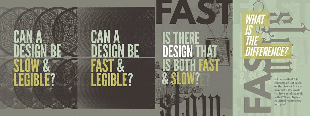
I’ve also adopted slowness in how I am deciding to make other types of personal work. I’ve been designing a series of posters, book pages, and presentation slides in an evolving, slow way. I started with a set palette of colors, limited range of typefaces, and constrained source of imagery. This is my own, personal vernacular system (ala The New Yorker). I’ve been investigating ideas on how sustainability, time and motion, and design all relate through a series of design-a-days. Often a design from one day builds directly on top of the day before. These designs are slow in how they take a limited range of starting points and attempt to churn out solutions with a limited formal language, only changing or adding new features when the old is no longer working.


In Conclusion.
Consideration of time and motion concepts exist throughout design’s history. Many investigations about how speed relate to a visual experience and understanding have occurred. Design and art history provide several examples of “fastness” and “slowness” in use. Innovations on the web and on television show places where slowness is gaining traction today.
Slow design describes designs requiring time to understand: more time spent viewing yields more information, more details, more nuance. Slow design should not be illegible nor obscure. Slowness isn’t tied to material or to handicraft. Slow design isn’t only connected to a viewer’s speed. Slow design is about engaging a viewer differently. Slow Design changes how and why design decisions are made. Slow design isn’t just part of our past, it should be part of our future(s).
Slowing down graphic design is not the abandoning of time and motion principles, it is instead turning them to the purpose of thoughtfulness and multiple design realities. I’m interested in how we find an alternative to the ever faster, ever flashier, ever more epileptic future. I hope slow design allows the exploration of a wiser, more thoughtful space where design need not shout at you, slap you in your optic nerve, or expect consumption in a split second.
However, if everything becomes “slow” design, everything becomes the same again, and slow design, just becomes design. Fast/Slow hybrids are necessary as they preserve thoughtfulness for those that can take it in, while still acknowledge that some of us might be running late to work or to the airport.
Works Cited:
- Adler, Mortimer J. Aristotle For Everybody. New York: Macmillan Publishing Co, Inc. 1978
- Beirut, Michael. Seventy-nine Short Essays on Design. New York: Princeton Architectural Press, 2007
- Brand, Stewart. How Buildings Learn: What Happens After They’re Built. New York: Penguin Group, 1994.
- Maholy-Nagy, László, “Space-Time Problems,” (1946) reprinted in ed. Richard Kostelanetz, Esthetics Contemporary, Buffalo: Prometheus Books, 1989.
- Mendelsund, Peter. What We See When We Read. New York: Vintage Books, 2014.
- Pfeiffer, Jon. Type & Tactic. 2009, Web, 09 February 2015.
- Venturi, Robert. Learning From Las Vegas. Cambridge: The MIT Press, 1977.
Written initially for the MODE Conference in Dublin Ireland, June 2015… As I was unable to attend said conference in the end, this was instead originally published on ookb.co on June 4, 2015.
